Heuristic evaluation
#2: Match between system and the real world
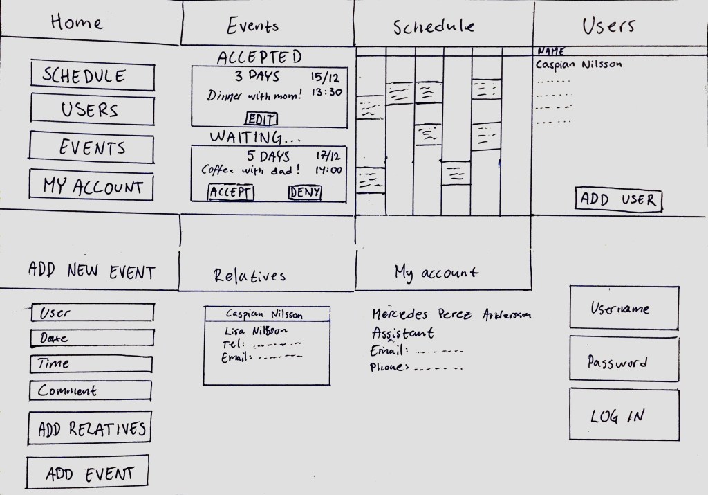
The choice of language in the user app is simple and easy to understand. The application does not use system specific language and instead uses a casual way of conveying the information. The home screen is simple and only conveys the most important information that is relevant for the user. The home screen also shows if there are any new requests for the user to look over, giving it a natural feel in the information you receive. The subsequent screens are in a logical order with giving it an overall natural information order.
The wording in the assistant app is more direct and concise then the user version. The application keeps a casual language despite the higher level of language and avoids the complex system-oriented terms. The home screen gives the assistant an easy way of quickly navigating to different screens with a logical order of information.
The “Match between system and the real world” rating is a 0 for its ease of use and uncluttered design.
#4: Consistency and standards
The applications use the same exterior design for navigation and hearing aid. The applications also share internal designs with coloring, shapes and layout. The only deviation between the applications is the easier language being used in the user application.
The “Consistency and standards” rating is a 1 because of the difference in level of language and home screen design. These are however not real issues because of the need for a differentiating design depending on the user group. The fix for this would a consistent language between the applications while keeping the ease of use for all user groups.
#6: Recognition rather than recall
The applications are similar in how they only keep the relevant information on the screen for the users need. The apps are design to only need the information on the page you are on in some rare cases direct you to a new page for information about specific details.
The “Recognition rather then recall” rating is a 0 since there are no instances in the applications that require you to recall something for a previous screen.
#7: Flexibility and efficiency of use
The layout of the applications is well thought out and was easy to navigate and was efficient in scheduling and communication.
The “Flexibility and efficiency of use” rating is a 0 since there was no issues in the flexibility.
#8: Aesthetic and minimalist design
The focus of the applications has always been their minimalistic designs and focus on ease of use. This means that the dialogs only contain the information that is relevant for the screen. There are also bigger buttons with a clear contrast to the background for an ease of understanding what you can click and what you cannot. The font used in the applications are on the other hand a bit harder to read.
The “Aesthetic and minimalist design” rating is a 1 since the design is overall very good and doesn’t focus on color coordination but has a font that can be hard to read. The fix for this is to change to a font with serifs for an easier reading experience.
Think aloud protocol
Two members of our group tried the app with their partners at home and asked them to navigate through the app prototype in Adobe XD. The members explained what the purpose of the app was, how it was supposed to be used and gave the subjects a few tasks: booking an event through the user interface, booking an event through the assistant interface, finding contact information about a relative, through the assistant interface. Moreover they were asked to generally navigate through the app, whilst thinking aloud and providing us with some thought and spontanious comments and reflections.
The booking of an event- USER
The subject was given the task to book an event as a user at an LSS facility would do. The subject found it difficult to locate the event booking information on the home screen, which gives info about the very next event that is going to take place and how much time is remaining. By finding the icon for calendar the subject was able to find the ”ADD NEW EVENT” button, but commenting on the appearence of the small icon, being hard to find and figure out that the new event booking takes place in the calendar. Some frustration was recorded trying to navigate through the app and booking an event. Some back buttons and home buttons didn’t work and caused frustration and irritation.
The booking of an event and finding a relative- ASSISTANT
The subjects respectively were given the tasks of finding a relative and booking an event. One subject tried to find the relative by clicking on ”Users” and accesing the user list. Clicking on a user name took the subject to the more info page about the user. Information about relative’s name was present but not clickable and therefore no possibility of contacting the relative or finding out the contact info. The contact possibility is only available through an existing, scheduled event for the user. The subject with task of booking an event through the assistant interface tried to do it by clicking on ”User events” and found only a list of booked events for the users that the assistant is responsible for. Finally, the subject remembered that through the icon for calendar, some kind of calendar should appear, and it did, with a big ”ADD NEW EVENT” button.
Reflections of the subjects
Some of the reflections generally about the app after navigating through it were that the user interface might be a bit hard to understand. Finding the event scheduling was frustrating but in itself the app in its’ function is limited, with big buttons and straight to the point. The suggestion is to completely remove the calendar function and only have events displayed that are occuring in the near future, as with the home screen. The app also seems to make the communication between user and assistant easier and perhaps should be marketed as a means of communication between those two parties. The subject suggested that the only ones who can determine if the functions of the app are useful and easy to use are the users themselves, perhaps in accordance with their assistants.